Efficiency Charts
A neat feature in CA:DE is the ability to visualize the recent and all-time efficiency percentage of economy units and production/research buildings, where efficiency means the time spent working vs the time being idle.
How to access the efficiency chart
Pro users can bring up the efficiency chart, click on an economy unit or a building, and then click its efficiency stat near the entity's HP.

The selection panel will now display two pie charts: one for last-minute efficiency, and another one for all-time efficiency.
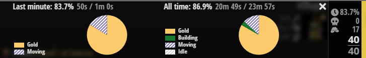
- A last-minute chart: This gives an overview of the recent efficiency rate of the selection, and is especially helpful for assessing the impact of real-time events. For example, a villager may be efficient overall, but may not be able to work briefly during a raid
- An all-time chart: This gives an overview of the total efficiency rate of the selection, and is mostly useful for assessing a player’s overall efficiency (their ability to keep things working at all times), as well as the value of a building
Hint: Choose many units or buildings to assess the overall efficiency rate of a group!
How to read the efficiency chart
The pie chart provides a handy legend section that breaks down the selection's activities during each chart's respective time durations.
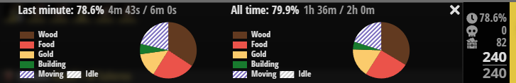
Striped slices indicate some sort of non-productive activity, such as time spent walking by villagers, or idle for economy units and buildings.
Larger striped slices in the all-time chart of units or buildings meant to be constantly working indicate a macro issue, which a player could use to diagnose why their economy is not growing as quickly as it could.
Last-minute charts are much more likely to fluctuate from moment to moment, but they are useful for diagnosing specific issues more precisely once a broader pattern is identified by the all-time chart. An example of this could be villagers starting to bump too much on a woodline or taking too long to walk back to deposit resources.