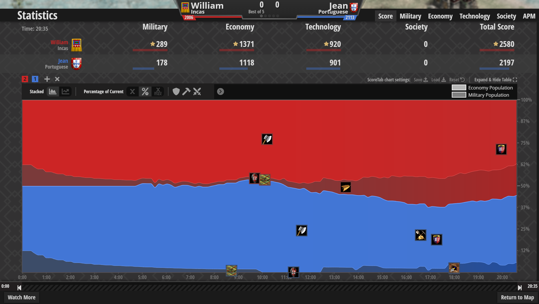
Match Statistics
While the Dashboard contains at-a-glance real-time data for many relevant match metrics, the Statistics Window provides an array of match aggregate data similar to the statistics screen of the game, plus some extra ones. Additionally, a configurable graph is available to help visualize things more easily.
Tab breakdown
At the top right several, tabs can be found for each statistic group.
- The Score contains a breakdown of the total score for each category that makes up a player’s total score
- The Military tab contains aggregates for things like the counts and ratios of Kills/Deaths, Conversion/Desertion, etc
- The Economy tab contains aggregates for things like total resource collection, market usage, tribute balance, gold generated from relics, etc
- The Technology tab contains aggregates for exploration, technology research count, and up-times
- The Society tab contains aggregates for trained economy units, castles built, etc
- The APM tab contains average, current, and peak geAPM values
Graph
The graph is a handy tool to visualize many of these metrics throughout the game. It can be configured to display different metrics concurrently and with a visualization style that makes sense for the data being displayed. Each tab can store a custom configuration, so you can, for example, change what data is displayed when viewing military vs. economy info.
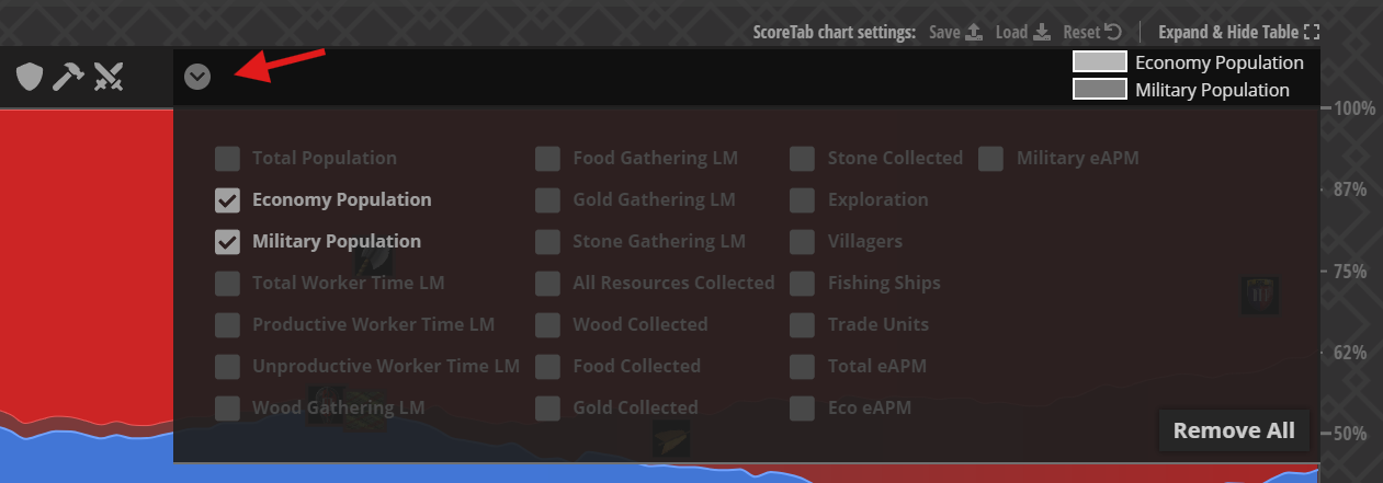
How to use the graph
Changing displayed data
A toggle icon is present above the graph. Upon clicking it, the full list of available metrics is displayed.
In the following example, we're showing the total amount of resources collected, and it can be seen how the red player started pulling ahead after researching eco upgrades earlier and delaying the castle age.
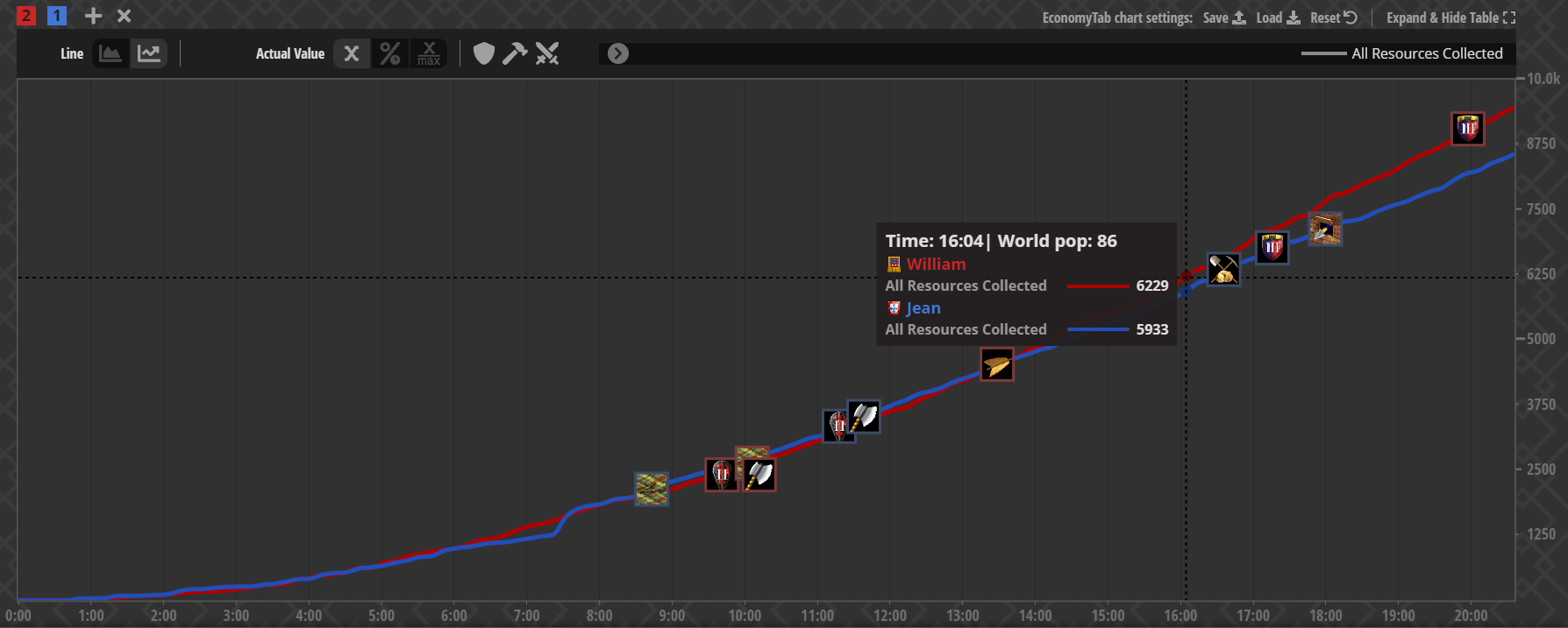
Note: You can hover over the graph at any spot to get a detailed per-player breakdown of values at that point of the game.
Changing display style
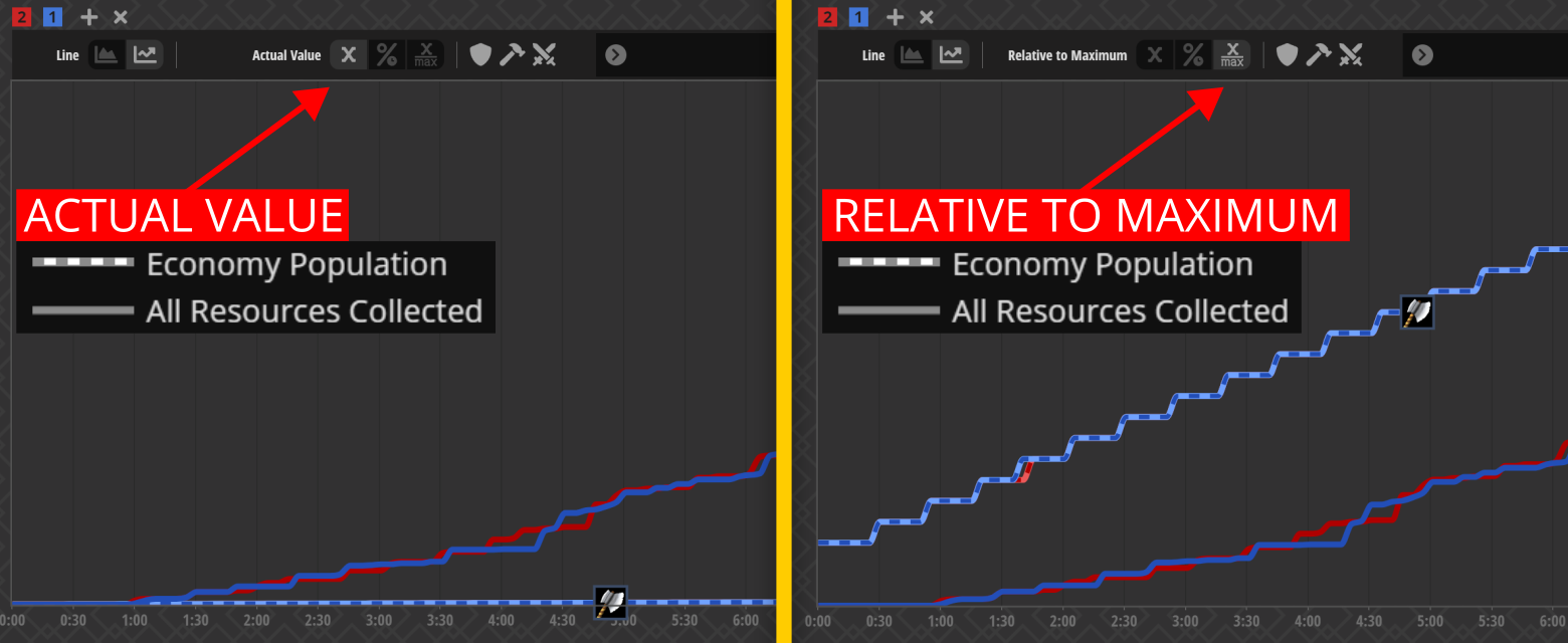
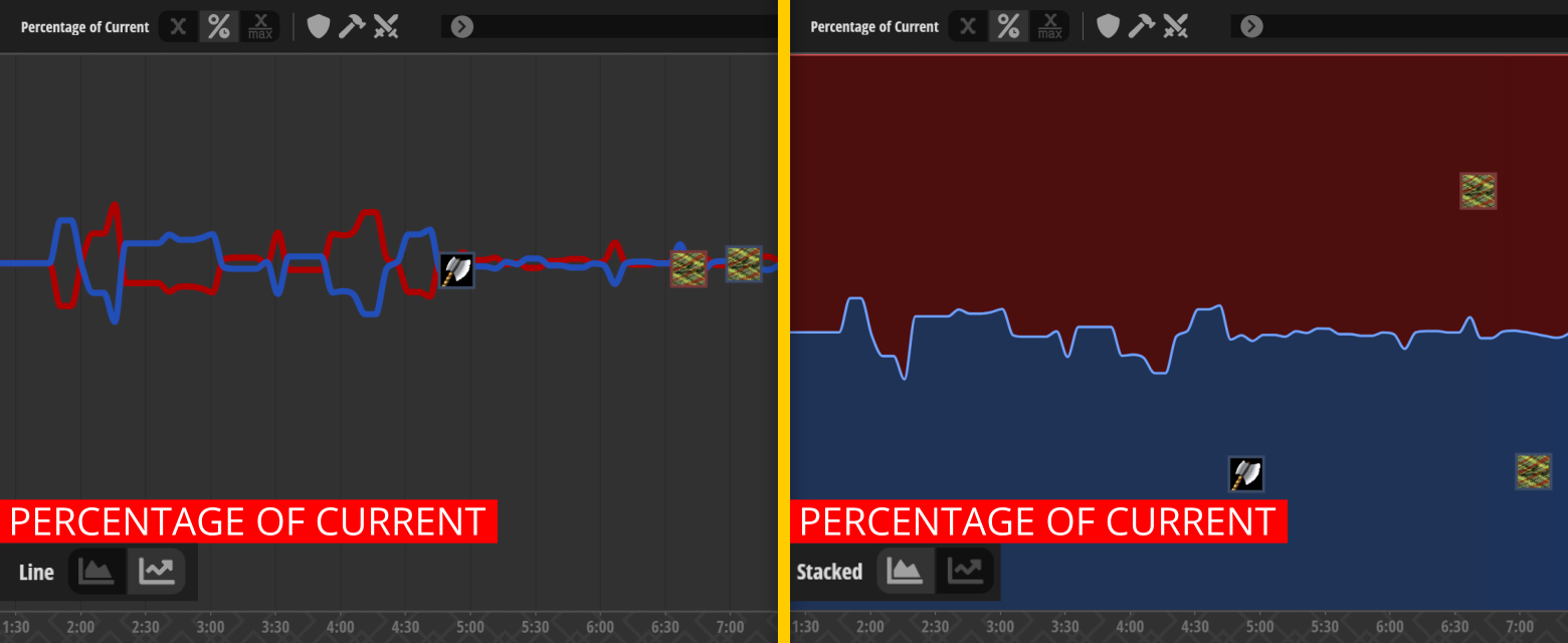
Because these different metrics can be combined in any way, CA:DE provides different visualization methods to help make sense of data with different value scales. For example, trying to see total resources collected and worker count at once can result in a squashed plot for worker count that is too hard to see, as it usually caps at ~140 while resources collected goes into the thousands.
In this example, the left-hand side of the image shows what it looks like when we’re visualizing both total resources collected and the count of economy units at once with a line chart displaying actual values. By contrast, changing this to display relative to the maximum values makes the economy count easier to see.
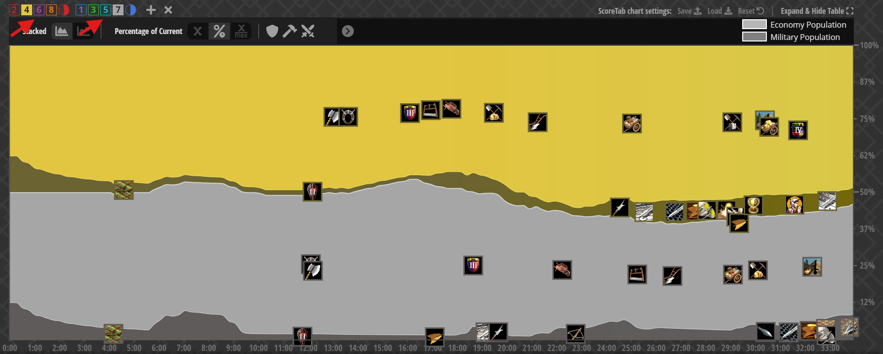
Likewise, it is possible to visualize player metrics relative to other players, either in line or stacked form.
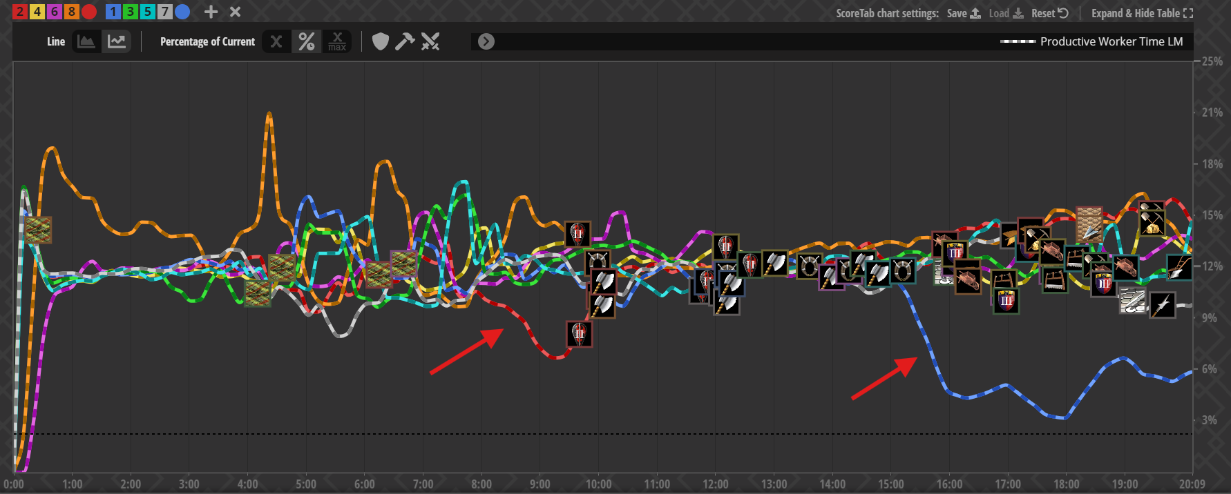
The line style, when combined with the "percentage of current" view, is especially useful for identifying outliers. In this example, we are displaying the productive worker time of 8 players. As the game goes on, you can see players generally have comparable numbers, however, it is very easy to see that blue's productive worker time plummeted towards the end of the graph.
Saving graphs
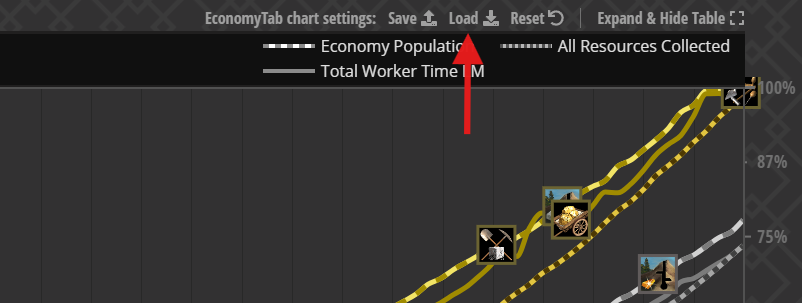
Once a user is happy with their graph settings for the current tab, they can save it using the "Save" button above the graph. If they make further changes to it, they can overwrite or restore their previous settings with the "Save" and "Load" buttons, respectively.
Note: It is also possible for them to restore the default settings at any point by using the "Reset" button
Muting players
Team games and free-for-all matches can get quite messy. For situations where too many players make it hard to compare things, it is possible to disable metrics corresponding to specific players by clicking on the player name or its corresponding colored square. For example, in this match, we have disabled 6 players so it’s easier to directly compare the remaining 2.
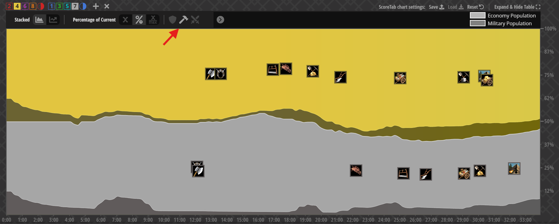
It is also possible to filter which technologies are displayed in the graph by using these filter buttons.
Practical note
While we provide some default settings for each statistic tab, users are able to change this to better accommodate their individual needs. For example, if a player is falling behind in economy consistently against their opponents, it could be due to several factors, such as struggling to keep training villagers, missing economy upgrades, mismanaged workers, etc. To help them diagnose the issue, they can set up graphs to look at economy unit count, resources collected, and productive worker time, respectively. This would allow them to identify which parts of a game are causing them to fall behind in different parts of their economy macro and micro.
Finally, it is possible to combine these metrics in any way, so users benefit from experimenting to find graph combinations that make sense for their needs, while balancing data overload.